


Have you ever wondered about the various contributing factors that decide the salary offered to an employee? 💸
Ever since I started my journey in the corporate world, I have wondered about this as well.
Here is my analysis of salary prediction. Hope you find your answers too!
Dataset link - bit.ly/2R6ZXqB
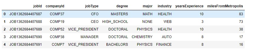
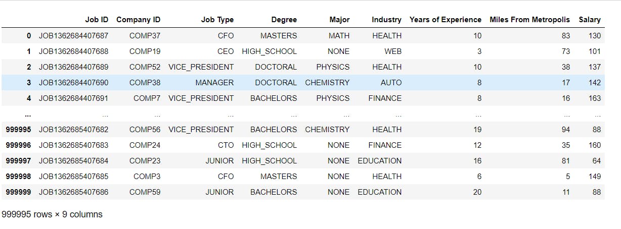
The dataset consists of information on job postings in various fields and their corresponding salaries. It comprises various columns like Job ID, Company ID, Job Type, Degree, Major, Industry, Years of Experience, Miles From Metropolis, and Salary.
In this, I have tried to visualize information like different types of job roles in the dataframe and their corresponding counts, the requirement of specific qualifications by the companies, different majors specified by the companies and their counts, which different industries do the openings belong to, mean salaries based on job type, major, degree, years of experience, and so on.
Libraries :
Pandas - provides several methods for reading data in different formats.
Matplotlib and seaborn - used for plotting basic and advanced visualizations respectively.
import pandas as pd
import numpy as np
import matplotlib.pyplot as plt
import seaborn as sns
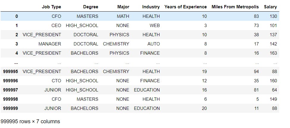
Reading and displaying the data :
We have two datasets in this project:
- features_df - consists of all the features taken into consideration while calculating salary.
- salaries_df - consist of the salary values based on the features.
features_df = pd.read_csv("features.csv")
salaries_df = pd.read_csv("salaries.csv")
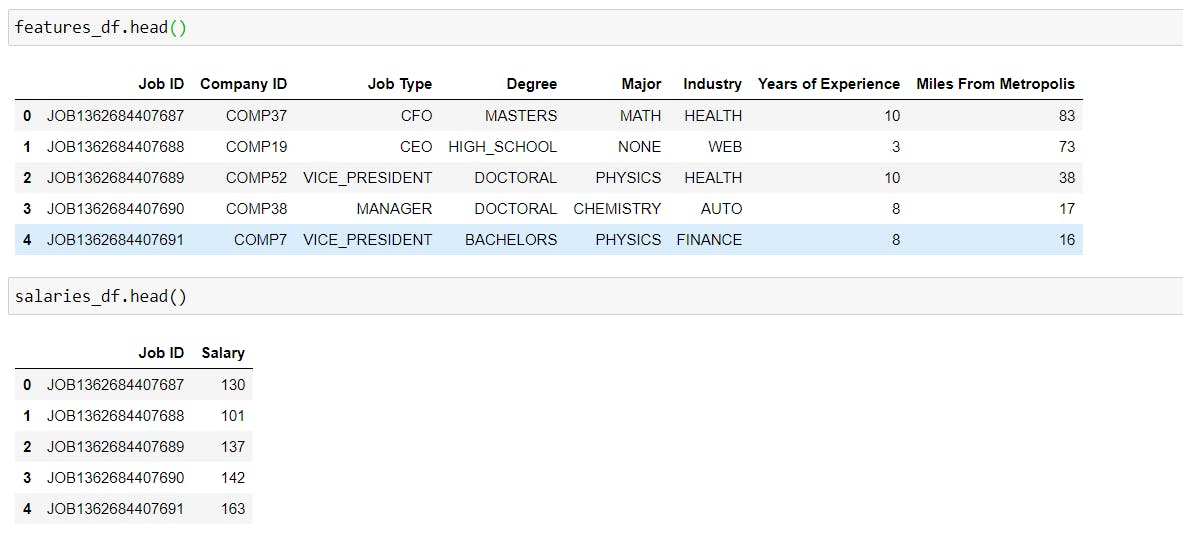
features_df.head()
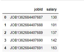
salaries_df.head()
Rename the columns of dataframe :
Renaming the existing column names.
#Rename the columns of dataset.
features_df.rename(columns = {"jobId":"Job ID", "companyId":"Company ID", "jobType":"Job Type", "degree":"Degree", "major":"Major", "industry":"Industry", "yearsExperience":"Years of Experience", "milesFromMetropolis":"Miles From Metropolis"}, inplace = True)
salaries_df.rename(columns = {"jobId":"Job ID", "salary":"Salary"}, inplace = True)
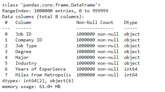
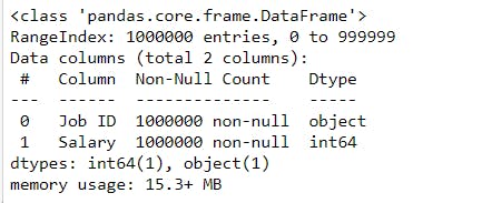
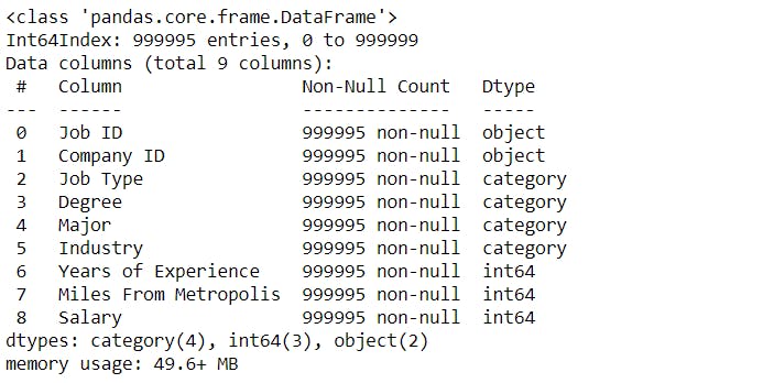
Information about dataframe :
- We can see that there are 1000000 entries in the dataframe.
- We can find the information about the non-null values and data type of all the in a dataframe.
# To get the information about the dataframe.
features_df.info()
salaries_df.info()
Missing Values :
To check if there are any missing values in the dataframe.
- We can see that there are no missing values in the dataset.
# To check for missing values
features_df.isnull().sum()
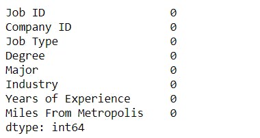
salaries_df.isnull().sum()

Data Type :
To check the data type of each column in the dataframe.
# To check the data type of the data frame.
features_df.dtypes
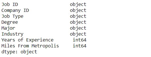
salaries_df.dtypes

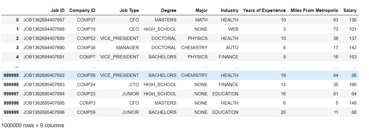
Merging the two dataframes :
As we have two datasets, we will combine both into a single dataframe.
#To merge the two data frames
merged = pd.merge(features_df, salaries_df, on ="Job ID", how = "inner")
merged
Duplicate values :
To check if there are any duplicate values in the dataframe.
merged.duplicated().any()
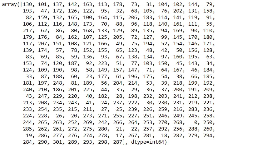
Unique salary values :
- We can observe that there is a "0" value in the salary column.
#To check the unique values in the Salary column.
merged["Salary"].unique()
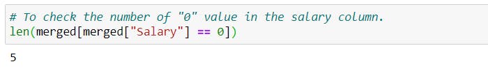
To check the number of rows having "0" as value and displaying the dataframe :
# To check the number of "0" value in the salary column.
len(merged[merged["Salary"] == 0])
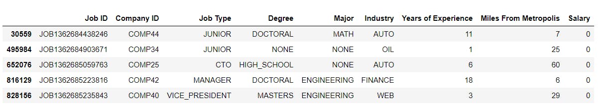
# To display the rows having "0" values.
merged[merged["Salary"] == 0]
Filtering the dataframe based on salary column :
# To filter out the rows having "0" value in Salary column.
merged = merged[merged.Salary != 0]
merged
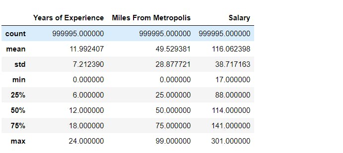
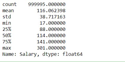
Statistical Analysis :
# Statistical analysis for numerical data.
merged.describe()
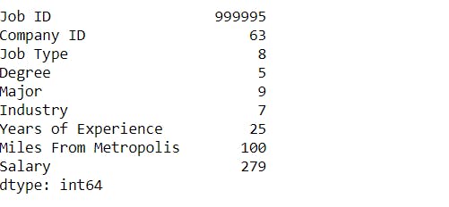
To check several unique values in dataframe :
# To check several unique values in the dataframe.
merged.nunique()
Data Analysis :
Job Type Distribution :
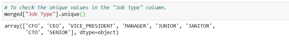
To find the unique values in the Job Type column.
To find the corresponding counts of all the unique values.
# To check the Unique values in the "Job Type" column.
merged["Job Type"].unique()
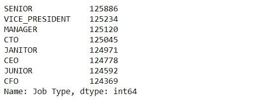
merged["Job Type"].value_counts()
plt.figure(figsize=(10, 8))
sns.countplot(x="Job Type", data=merged)
plt.xticks(rotation = 90)
plt.yticks(np.arange(0, 130000, 10000))
plt.show()
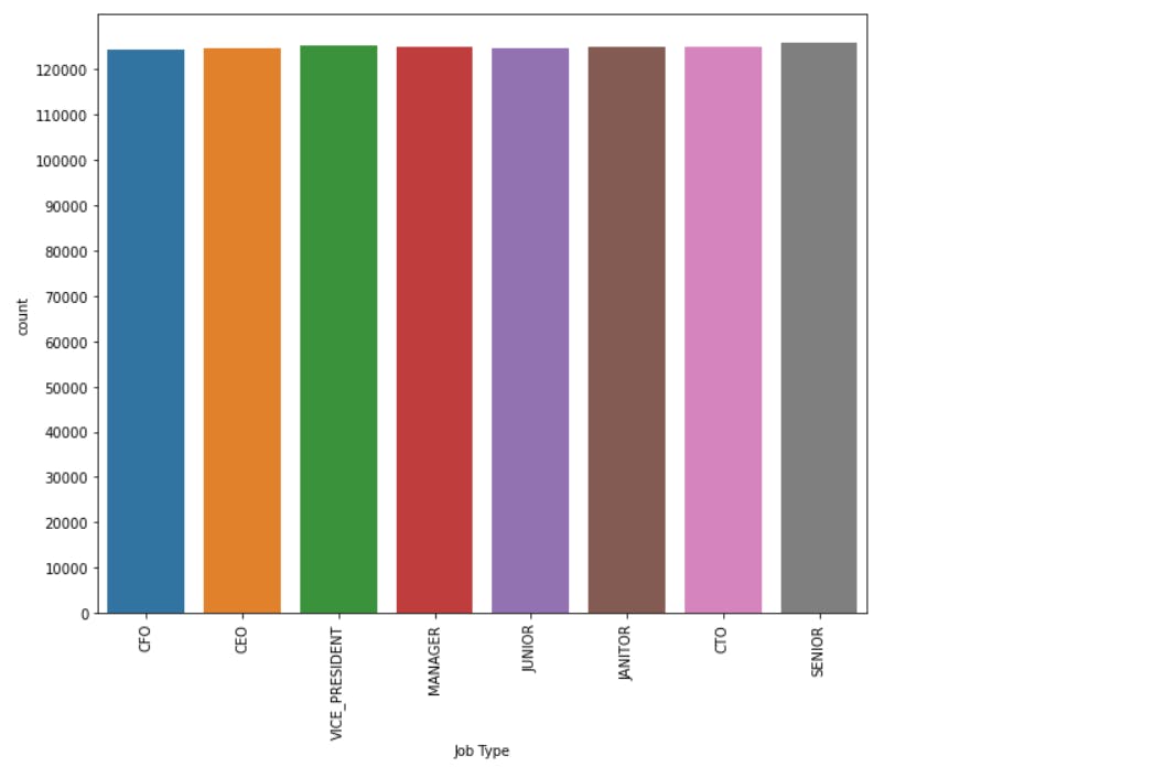 We can observe that the number of postings for all the job roles in the dataframe is almost equal.
Degree distribution :
To find the unique values in the Degree column.
To find the corresponding counts of all the unique values.
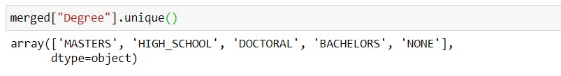
merged["Degree"].unique()
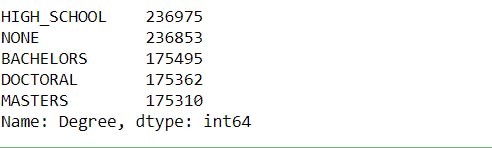
Degree = merged["Degree"].value_counts()
Degree
plt.figure(figsize=(10, 8))
labels = 'MASTERS', 'HIGH_SCHOOL', 'DOCTORAL', 'BACHELORS', 'NONE'
plt.pie(Degree.values, labels = labels, shadow = True, autopct='%1.1f%%', startangle=90)
plt.show()
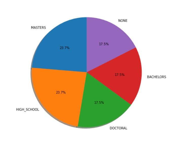 23.7% of the job postings require either a master's or a high school degree. Whereas, 17.5% of the job postings do not require any degree.
Major Distribution :
merged["Major"].unique()
Major = merged["Major"].value_counts()
Major
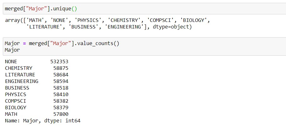
plt.bar(Major.index, Major.values, color ='maroon',width = 0.8)
plt.xticks(rotation = 90)
plt.show()
 Most of the jobs posted do not require any specific majors.
Industry distribution :
merged["Industry"].unique()
merged["Industry"].value_counts()
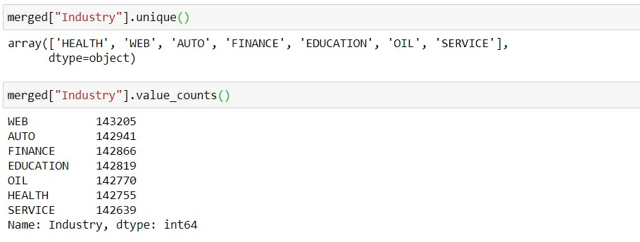
plt.figure(figsize=(10, 8))
sns.countplot(x="Industry", data=merged)
plt.xticks(rotation = 90)
plt.yticks(np.arange(0, 150000 , 10000))
plt.show()
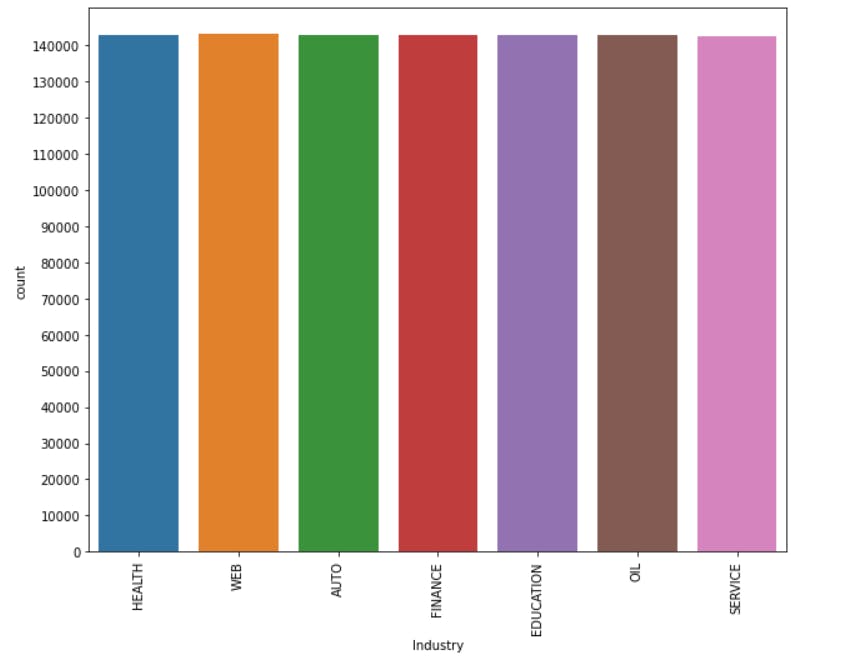 There is an equal number of job postings for all the Industries.
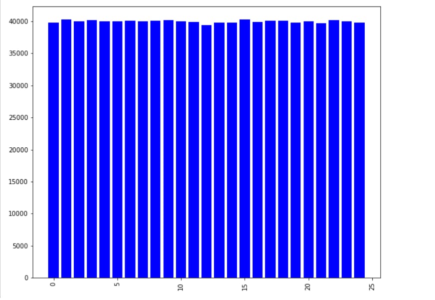
Years Of Experience :
Experience = merged["Years of Experience"].value_counts()
Experience
plt.figure(figsize=(10, 8))
plt.bar(Experience.index, Experience.values, color ='blue',width = 0.8)
plt.xticks(rotation = 90)
plt.show()
Salary :
- To check if the salary distribution is symmetric or skewed.
# To check if the Salary distribution is symmetric or skewed.
print('Salary Skewness:', merged['Salary'].skew())
if -0.5 <= merged['Salary'].skew() <= 0.5:
    print("Salary distribution is symmetric")
else:
    print("Salary distribution is skewed")

# Distribution plot
plt.figure(figsize=(10, 8))
sns.distplot(merged['Salary'], bins=40, kde=True, norm_hist=True)
plt.axvline(merged['Salary'].mean(), color='black')
plt.axvline(merged['Salary'].median(), color='darkblue', linestyle='--')
plt.show()
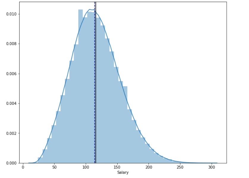
print("The black line in distribution plot is the mean salary", merged['Salary'].mean())
print("The dark blue line in distribution plot is the median salary", merged['Salary'].median())

#Box plot
plt.figure(figsize=(18, 6))
sns.boxplot(merged['Salary'], color='gold')
plt.show()
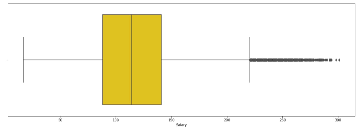
stat = merged.Salary.describe()
stat
IQR = stat['75%'] - stat['25%']
upper = stat['75%'] + 1.5 * IQR
lower = stat['25%'] - 1.5 * IQR
print('The Upper and Lower Bounds for suspected outliers in the Boxplot are {} and {}.'.format(upper, lower))

Displaying correlation between features and target variable:
columns = ["Job Type", "Degree", "Major", "Industry"]
for col in columns:
    plt.figure(figsize = (14, 6))
    sns.boxplot(x=col, y='Salary', data = merged.sort_values('Salary'))
    plt.xticks(rotation = 45)
    plt.ylabel('Salaries')
    plt.title('Relationship of Salary with {}'.format(col))
    plt.show()
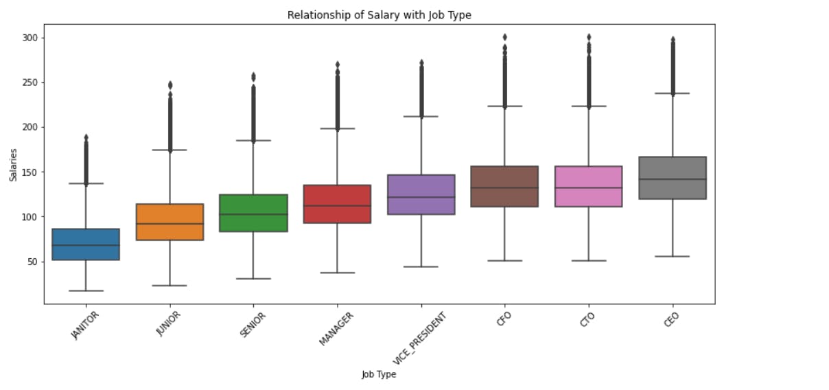 We can observe that the salary increases as the post of the employee increases that is from janitor to the CEO of the company.
We can similarly observe the correlation of other features with the salary.
Correlation between Experience and Salary using Regression Plot :
plt.figure(figsize=(8, 6))
sns.regplot(x="Years of Experience", y="Salary", data = merged)
plt.show()
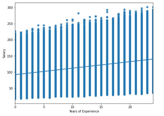 We can conclude that as the number of years of experience increases, the salary also increases.
Correlation between Salary and Miles from Metro using Regression Plot :
plt.figure(figsize=(8, 6))
sns.regplot(x="Miles From Metropolis", y="Salary", data = merged)
plt.show()
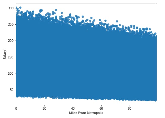 We can definitely see a negative correlation between Miles from Metropolis and Salary. This is somewhat understandable as most of the jobs are normally offered closer to the city center.
Mean Salary in Job Type, Degree, Major, Industry, Years of Experience :
- We need to group the values based on a particular column, then calculate the mean of the Salary column and arrange it in ascending order.
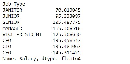
Job Type -
mean_salary_job_type = merged.groupby("Job Type")["Salary"].mean().sort_values()
mean_salary_job_type
mean_salary_job_type.plot()
plt.xticks(rotation =45)
plt.ylabel("Mean Salary")
plt.show()
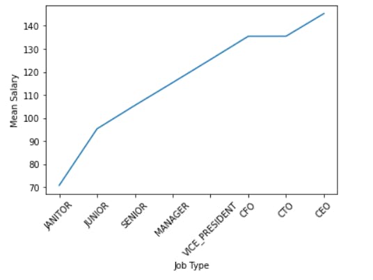 We can see that mean salary increases from janitor to CEO. The mean salary for CFO and CTO is approximately the same.
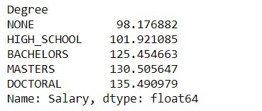
Degree -
mean_salary_Degree = merged.groupby("Degree")["Salary"].mean().sort_values()
mean_salary_Degree
mean_salary_Degree.plot()
plt.xticks(rotation =45)
plt.ylabel("Mean Salary")
plt.show()
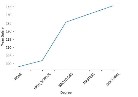 The employees having a doctoral degree are paid the highest whereas the mean salary of employees with no relevant degree is very low.
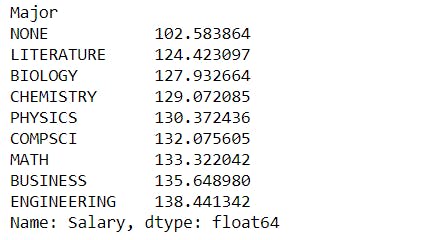
Major -
mean_salary_Major = merged.groupby("Major")["Salary"].mean().sort_values()
mean_salary_Major
mean_salary_Major.plot()
plt.xticks(rotation =45)
plt.ylabel("Mean Salary")
plt.show()
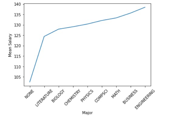 The employee with an engineering background is paid the highest.
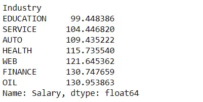
Industry -
mean_salary_Industry = merged.groupby("Industry")["Salary"].mean().sort_values()
mean_salary_Industry
mean_salary_Industry.plot()
plt.xticks(rotation =45)
plt.ylabel("Mean Salary")
plt.show()
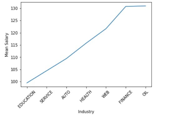 The education sector has the lowest mean salary, whereas the oil industry pays the highest mean salary.
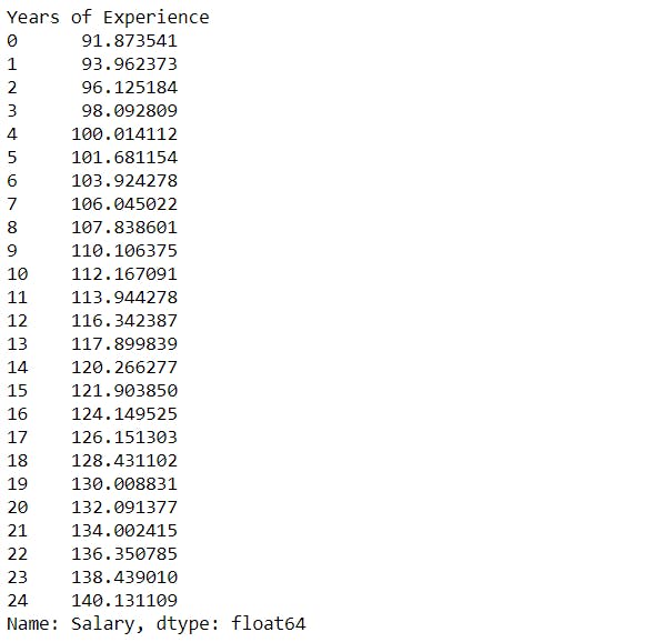
Experience -
mean_salary_Experience = merged.groupby("Years of Experience")["Salary"].mean().sort_values()
mean_salary_Experience
mean_salary_Experience.plot()
plt.xticks(rotation =45)
plt.ylabel("Mean Salary")
plt.show()
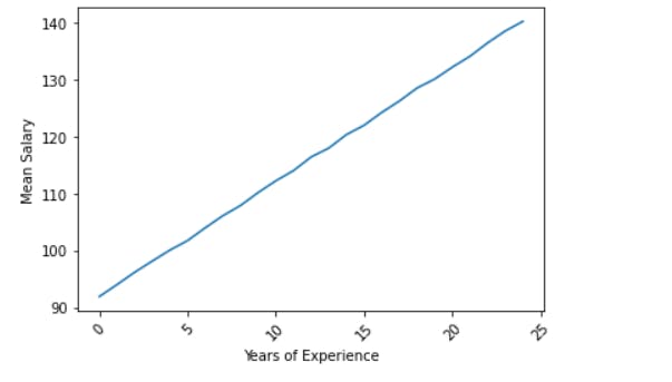 As the experience increases, the mean salary also increases.
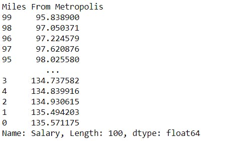
Miles From Metropolis -
mean_salary_miles = merged.groupby("Miles From Metropolis")["Salary"].mean().sort_values()
mean_salary_miles
mean_salary_miles.plot()
plt.xticks(rotation =45)
plt.ylabel("Mean Salary")
plt.show()
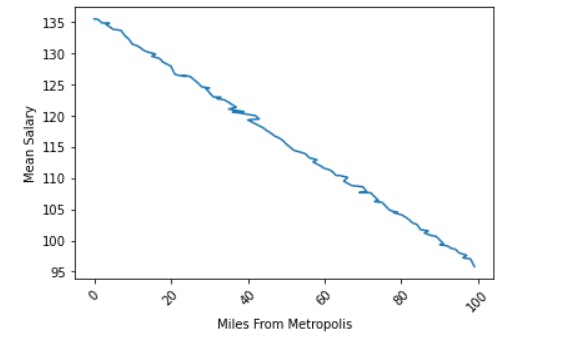 Nearer to the city center, more is the salary. The mean salary decreases as you go away from the city center.
Multiple plots:
Plotting multiple features in a single plot Vs salary.
mean_salary_job_type1 = merged.groupby("Job Type")["Salary"].mean().sort_values()[1:6]
mean_salary_Degree1 = merged.groupby("Degree")["Salary"].mean().sort_values()
mean_salary_Major1 = merged.groupby("Major")["Salary"].mean().sort_values()[4:]
mean_salary_Industry1 = merged.groupby("Industry")["Salary"].mean().sort_values()[2:]
mean_salary_Experience1 = merged.groupby("Years of Experience")["Salary"].mean().sort_values()[:5]
fig,axis = plt.subplots(nrows=1,ncols=1,figsize=(13,6))
mean_salary_job_type1.plot()
mean_salary_Degree1.plot()
mean_salary_Major1.plot()
mean_salary_Industry1.plot()
mean_salary_Experience1.plot()
axis.set_xticklabels([" ", "a", " ", "b", " ", "c", " ", "d", " ", "e", " " ])
plt.xlabel("Features")
plt.ylabel("Mean Salary")
plt.show()
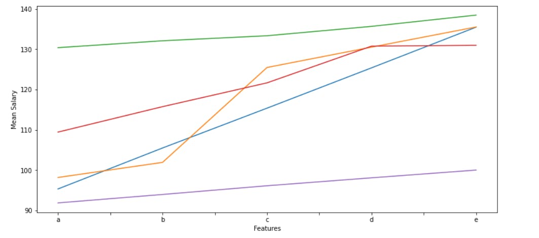 Here, the values "a", "b", "c", "d", "e" on the x-axis represents -
"a" - represents Junior(Job Type), None(Degree), Physics(Major), Auto(Industry) and 0(Experience).
"b" - represents Senior(Job Type), High School(Degree), CompSci(Major), Health(Industry) and 5(Experience).
"c" - represents Manager(Job Type), Bachelors(Degree), Math(Major), Web(Industry) and 10(Experience).
"d" - represents Vice President(Job Type), Masters(Degree), Business(Major), Finance(Industry) and 15(Experience).
"e" - represents CFO(Job Type), Doctoral(Degree), Engineering(Major), Oil(Industry) and 20(Experience).
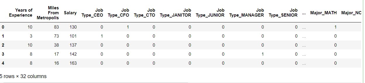
Correlation plot :
Make a copy of the dataframe.
Convert the "object" datatype into "category".
Drop "Job ID" and "Company ID" columns.
Encode the categorical data type.
corr_plot = merged.copy()
cols = ["Job Type", "Degree", "Major", "Industry"]
for i in cols:
    corr_plot[i] = corr_plot[i].astype("category")
corr_plot.info()
corr_plot = corr_plot.drop("Job ID", axis=1)
corr_plot = corr_plot.drop("Company ID", axis=1)
corr_plot
#One hot encode categorical data in the dataset

corr_plot = pd.get_dummies(corr_plot)
corr_plot.head()
plt.figure(figsize = (10, 8))
sns.heatmap(corr_plot.corr(), cmap = 'BuGn', linewidth = 0.005)
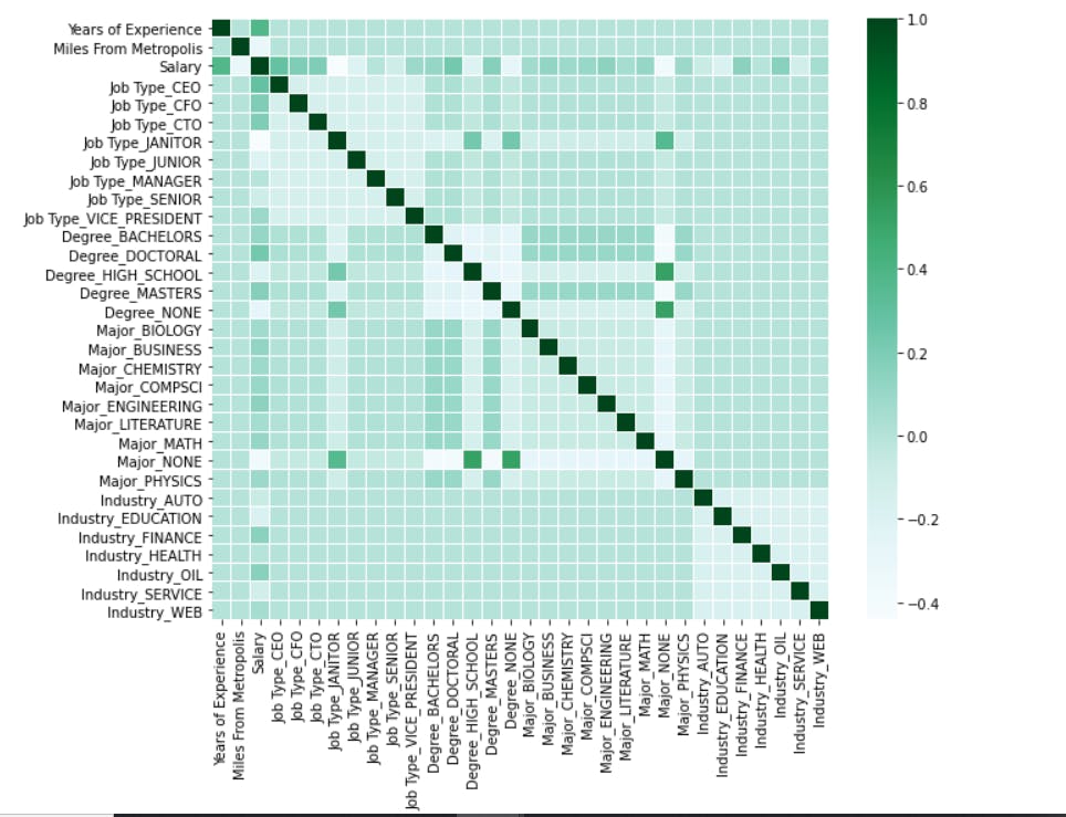 This plot shows the correlation of every column with other columns present in the dataframe.
Yay! 🥳 You made it till the end. Hope you found it interesting.